What the scan tells you
For every commitment your team has made — a client deadline, a launch date, a board promise — the scan gives you a probability. Not a guess. Not a traffic-light status. A number based on how your team actually delivers.
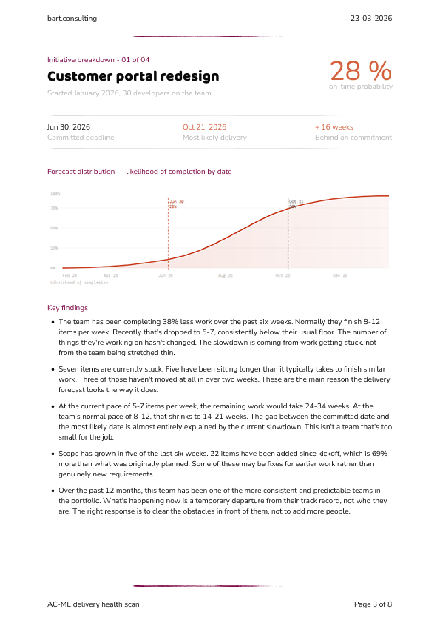
You told the client June 30. The simulation says there’s a 28% chance of making it. The most likely delivery date is October 21 — 16 weeks late. The main drivers: seven items stuck for over two weeks, and scope that’s grown 69% since kickoff.
That’s what we work with when we sit down. Not “are we behind?” — we already know. The question is what to do about it.
Click the images to view in high resolution
Download the full example report (PDF)
How it works
Step one: I learn how you track your work
Every team uses their tools differently. “In Progress” means something different in your team than it does in mine. Before I touch a number, I build a clean model of how work actually moves through your pipeline — what the stages mean, where handoffs happen, where things stall. The raw data is useless without this.
If your Jira is a mess, that’s expected. The mess isn’t a blocker — it’s where I start.
Step two: I map what you’ve promised versus what’s left
Every open commitment, every piece of remaining work, and — this is usually the uncomfortable part — everything that got quietly added after you agreed on the scope.
Step three: I run the math
I take your team’s actual completion times — the full range, not an average — and use that to project forward. The fast weeks and the slow weeks. Then I simulate each commitment 10,000 times. Each run picks different completion times from that range and plays the remaining work forward.
Some runs finish early. Some finish late. The pattern across all those runs tells you something a gut estimate never can: how likely you are to land on the date you promised.
The output isn’t a single date. It’s a probability curve. A narrow curve means a predictable team. A wide curve means high variability in outcomes. Both are useful to know.
What the data captures, and what it doesn’t.
The simulation uses the full range of delivery speeds your team has actually experienced. That includes the weeks where reviews dragged, where someone was out, where a dependency didn’t land. It captures the patterns your team already lives with.
What it doesn’t do is predict things that have never happened. If your lead architect gets poached next Tuesday, no model saw that coming. But that’s not what catches most teams. Most teams get caught by the slow, ordinary accumulation of normal variation — the kind everyone dismisses as “just one of those weeks” until there have been eight of them.
What data I need (and what I never see)
I built an open-source exporter for Jira Cloud. It pulls one thing: when work moved from one status to another. That’s it.
No ticket descriptions. No comments. No attachments. No code. No client names.
You install it, you run it, you review the output before you send anything. Nothing leaves your environment without you choosing to share it.
If your team uses Azure DevOps, I can set up a comparable export — same principle, same boundaries.
If your security or legal team wants to review the process first, I’ll walk them through it. It usually takes ten minutes.
What you get
The scan covers up to five active initiatives. This is deliberate. More than five dilutes the analysis and leads to surface-level reporting. The goal is depth over breadth: a clear, honest read on the initiatives that matter most.
For each initiative, you get the on-time probability, the most likely delivery date, the key drivers of risk, and concrete recommendations. Renegotiate the deadline. Cut what’s not essential. Reassign people. Whatever fits your situation.
The scan ends with a working session. Not a presentation. We take the most dangerous commitment and decide what to do about it. You leave knowing exactly what changes on Monday morning.
Four weeks later, we check in to see what moved.